library(tidyverse)
#> ── Attaching core tidyverse packages ───────────────────── tidyverse 2.0.0 ──
#> ✔ dplyr     1.2.1     ✔ readr     2.2.0
#> ✔ forcats   1.0.1     ✔ stringr   1.6.0
#> ✔ ggplot2   4.0.3     ✔ tibble    3.3.1
#> ✔ lubridate 1.9.5     ✔ tidyr     1.3.2
#> ✔ purrr     1.2.2
#> ── Conflicts ─────────────────────────────────────── tidyverse_conflicts() ──
#> ✖ dplyr::filter() masks stats::filter()
#> ✖ dplyr::lag()    masks stats::lag()
#> ℹ Use the conflicted package (<http://conflicted.r-lib.org/>) to force all conflicts to become errors1 Data visualization
1.1 Introduction
“The simple graph has brought more information to the data analyst’s mind than any other device.” — John Tukey
R has several systems for making graphs, but ggplot2 is one of the most elegant and most versatile. ggplot2 implements the grammar of graphics, a coherent system for describing and building graphs. With ggplot2, you can do more and faster by learning one system and applying it in many places.
This chapter will teach you how to visualize your data using ggplot2. We will start by creating a simple scatterplot and use that to introduce aesthetic mappings and geometric objects – the fundamental building blocks of ggplot2. We will then walk you through visualizing distributions of single variables as well as visualizing relationships between two or more variables. We’ll finish off with saving your plots and troubleshooting tips.
1.1.1 Prerequisites
This chapter focuses on ggplot2, one of the core packages in the tidyverse. To access the datasets, help pages, and functions used in this chapter, load the tidyverse by running:
That one line of code loads the core tidyverse; the packages that you will use in almost every data analysis. It also tells you which functions from the tidyverse conflict with functions in base R (or from other packages you might have loaded)1.
If you run this code and get the error message there is no package called 'tidyverse', you’ll need to first install it, then run library() once again.
install.packages("tidyverse")
library(tidyverse)
You only need to install a package once, but you need to load it every time you start a new session.
In addition to tidyverse, we will also use the palmerpenguins package, which includes the penguins dataset containing body measurements for penguins on three islands in the Palmer Archipelago, and the ggthemes package, which offers a colorblind safe color palette.
library(palmerpenguins)
#>
#> Attaching package: 'palmerpenguins'
#> The following objects are masked from 'package:datasets':
#>
#>     penguins, penguins_raw
library(ggthemes)
1.2 First steps
Do penguins with longer flippers weigh more or less than penguins with shorter flippers? You probably already have an answer, but try to make your answer precise. What does the relationship between flipper length and body mass look like? Is it positive? Negative? Linear? Nonlinear? Does the relationship vary by the species of the penguin? How about by the island where the penguin lives? Let’s create visualizations that we can use to answer these questions.
1.2.1 The penguins data frame
You can test your answers to those questions with the penguins data frame found in palmerpenguins (a.k.a. palmerpenguins::penguins). A data frame is a rectangular collection of variables (in the columns) and observations (in the rows). penguins contains 344 observations collected and made available by Dr. Kristen Gorman and the Palmer Station, Antarctica LTER2.
To make the discussion easier, let’s define some terms:
A variable is a quantity, quality, or property that you can measure.
A value is the state of a variable when you measure it. The value of a variable may change from measurement to measurement.
An observation is a set of measurements made under similar conditions (you usually make all of the measurements in an observation at the same time and on the same object). An observation will contain several values, each associated with a different variable. We’ll sometimes refer to an observation as a data point.
Tabular data is a set of values, each associated with a variable and an observation. Tabular data is tidy if each value is placed in its own “cell”, each variable in its own column, and each observation in its own row.
In this context, a variable refers to an attribute of all the penguins, and an observation refers to all the attributes of a single penguin.
Type the name of the data frame in the console and R will print a preview of its contents. Note that it says tibble on top of this preview. In the tidyverse, we use special data frames called tibbles that you will learn more about soon.
penguins
#> # A tibble: 344 × 8
#>   species island    bill_length_mm bill_depth_mm flipper_length_mm
#>   <fct>   <fct>              <dbl>         <dbl>             <int>
#> 1 Adelie  Torgersen           39.1          18.7               181
#> 2 Adelie  Torgersen           39.5          17.4               186
#> 3 Adelie  Torgersen           40.3          18                 195
#> 4 Adelie  Torgersen           NA            NA                  NA
#> 5 Adelie  Torgersen           36.7          19.3               193
#> 6 Adelie  Torgersen           39.3          20.6               190
#> # ℹ 338 more rows
#> # ℹ 3 more variables: body_mass_g <int>, sex <fct>, year <int>
This data frame contains 8 columns. For an alternative view, where you can see all variables and the first few observations of each variable, use glimpse(). Or, if you’re in RStudio, run View(penguins) to open an interactive data viewer.
glimpse(penguins)
#> Rows: 344
#> Columns: 8
#> $ species           <fct> Adelie, Adelie, Adelie, Adelie, Adelie, Adelie, A…
#> $ island            <fct> Torgersen, Torgersen, Torgersen, Torgersen, Torge…
#> $ bill_length_mm    <dbl> 39.1, 39.5, 40.3, NA, 36.7, 39.3, 38.9, 39.2, 34.…
#> $ bill_depth_mm     <dbl> 18.7, 17.4, 18.0, NA, 19.3, 20.6, 17.8, 19.6, 18.…
#> $ flipper_length_mm <int> 181, 186, 195, NA, 193, 190, 181, 195, 193, 190, …
#> $ body_mass_g       <int> 3750, 3800, 3250, NA, 3450, 3650, 3625, 4675, 347…
#> $ sex               <fct> male, female, female, NA, female, male, female, m…
#> $ year              <int> 2007, 2007, 2007, 2007, 2007, 2007, 2007, 2007, 2…
Among the variables in penguins are:
species: a penguin’s species (Adelie, Chinstrap, or Gentoo).flipper_length_mm: length of a penguin’s flipper, in millimeters.body_mass_g: body mass of a penguin, in grams.
To learn more about penguins, open its help page by running ?penguins.
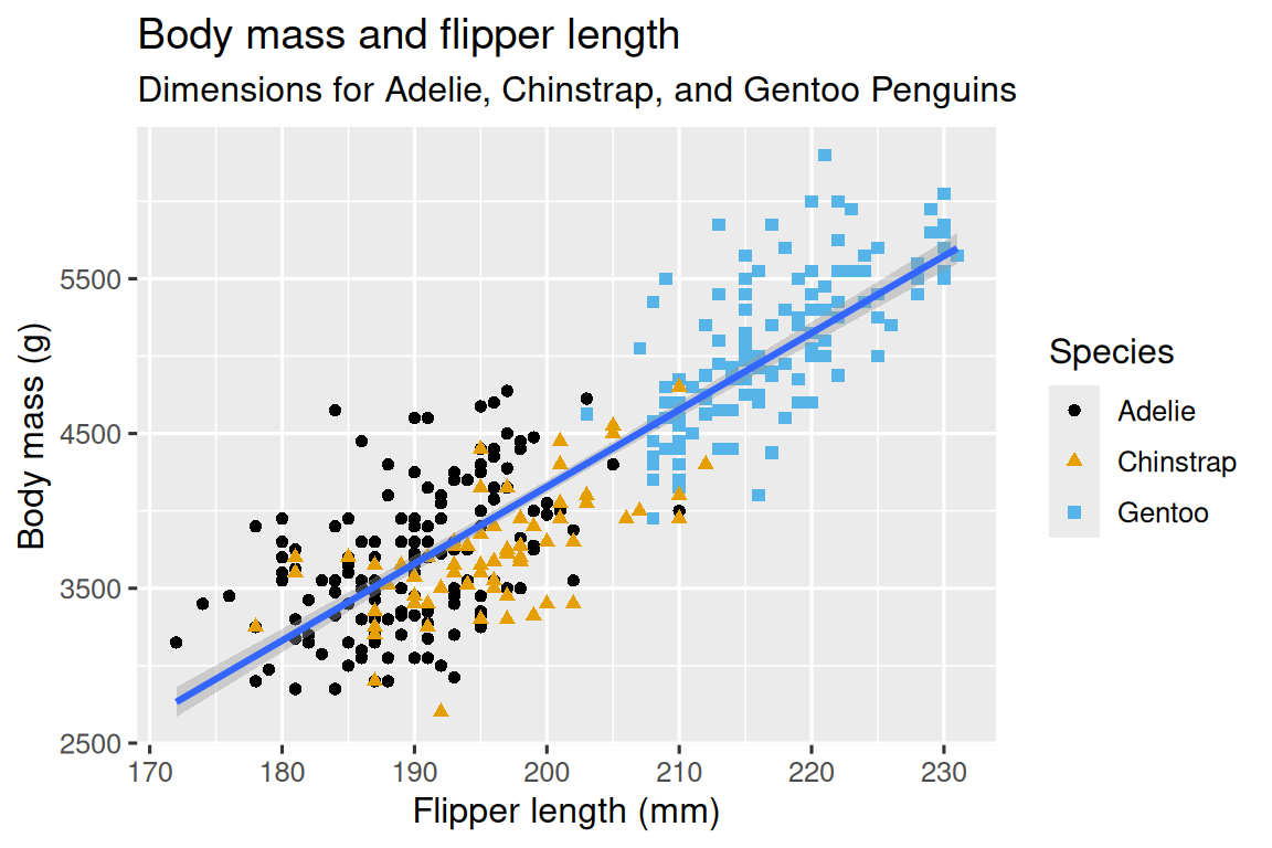
1.2.2 Ultimate goal
Our ultimate goal in this chapter is to recreate the following visualization displaying the relationship between flipper lengths and body masses of these penguins, taking into consideration the species of the penguin.
1.2.3 Creating a ggplot
Let’s recreate this plot step-by-step.
With ggplot2, you begin a plot with the function ggplot(), defining a plot object that you then add layers to. The first argument of ggplot() is the dataset to use in the graph and so ggplot(data = penguins) creates an empty graph that is primed to display the penguins data, but since we haven’t told it how to visualize it yet, for now it’s empty. This is not a very exciting plot, but you can think of it like an empty canvas you’ll paint the remaining layers of your plot onto.
ggplot(data = penguins)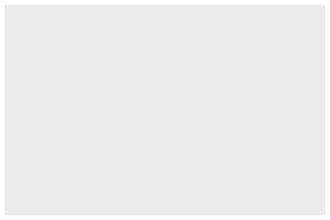
Next, we need to tell ggplot() how the information from our data will be visually represented. The mapping argument of the ggplot() function defines how variables in your dataset are mapped to visual properties (aesthetics) of your plot. The mapping argument is always defined in the aes() function, and the x and y arguments of aes() specify which variables to map to the x and y axes. For now, we will only map flipper length to the x aesthetic and body mass to the y aesthetic. ggplot2 looks for the mapped variables in the data argument, in this case, penguins.
The following plot shows the result of adding these mappings.

Our empty canvas now has more structure – it’s clear where flipper lengths will be displayed (on the x-axis) and where body masses will be displayed (on the y-axis). But the penguins themselves are not yet on the plot. This is because we have not yet articulated, in our code, how to represent the observations from our data frame on our plot.
To do so, we need to define a geom: the geometrical object that a plot uses to represent data. These geometric objects are made available in ggplot2 with functions that start with geom_. People often describe plots by the type of geom that the plot uses. For example, bar charts use bar geoms (geom_bar()), line charts use line geoms (geom_line()), boxplots use boxplot geoms (geom_boxplot()), scatterplots use point geoms (geom_point()), and so on.
The function geom_point() adds a layer of points to your plot, which creates a scatterplot. ggplot2 comes with many geom functions that each adds a different type of layer to a plot. You’ll learn a whole bunch of geoms throughout the book, particularly in Chapter 9.
ggplot(
  data = penguins,
  mapping = aes(x = flipper_length_mm, y = body_mass_g)
) +
geom_point()
#> Warning: Removed 2 rows containing missing values or values outside the scale range
#> (`geom_point()`).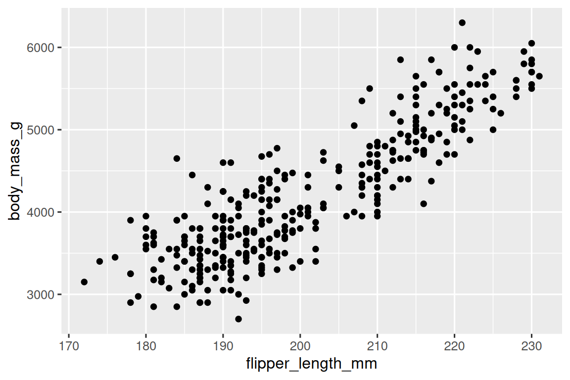
Now we have something that looks like what we might think of as a “scatterplot”. It doesn’t yet match our “ultimate goal” plot, but using this plot we can start answering the question that motivated our exploration: “What does the relationship between flipper length and body mass look like?” The relationship appears to be positive (as flipper length increases, so does body mass), fairly linear (the points are clustered around a line instead of a curve), and moderately strong (there isn’t too much scatter around such a line). Penguins with longer flippers are generally larger in terms of their body mass.
Before we add more layers to this plot, let’s pause for a moment and review the warning message we got:
Removed 2 rows containing missing values (
geom_point()).
We’re seeing this message because there are two penguins in our dataset with missing body mass and/or flipper length values and ggplot2 has no way of representing them on the plot without both of these values. Like R, ggplot2 subscribes to the philosophy that missing values should never silently go missing. This type of warning is probably one of the most common types of warnings you will see when working with real data – missing values are a very common issue and you’ll learn more about them throughout the book, particularly in Chapter 18. For the remaining plots in this chapter we will suppress this warning so it’s not printed alongside every single plot we make.
1.2.4 Adding aesthetics and layers
Scatterplots are useful for displaying the relationship between two numerical variables, but it’s always a good idea to be skeptical of any apparent relationship between two variables and ask if there may be other variables that explain or change the nature of this apparent relationship. For example, does the relationship between flipper length and body mass differ by species? Let’s incorporate species into our plot and see if this reveals any additional insights into the apparent relationship between these variables. We will do this by representing species with different colored points.
To achieve this, will we need to modify the aesthetic or the geom? If you guessed “in the aesthetic mapping, inside of aes()”, you’re already getting the hang of creating data visualizations with ggplot2! And if not, don’t worry. Throughout the book you will make many more ggplots and have many more opportunities to check your intuition as you make them.
ggplot(
  data = penguins,
  mapping = aes(x = flipper_length_mm, y = body_mass_g, color = species)
) +
  geom_point()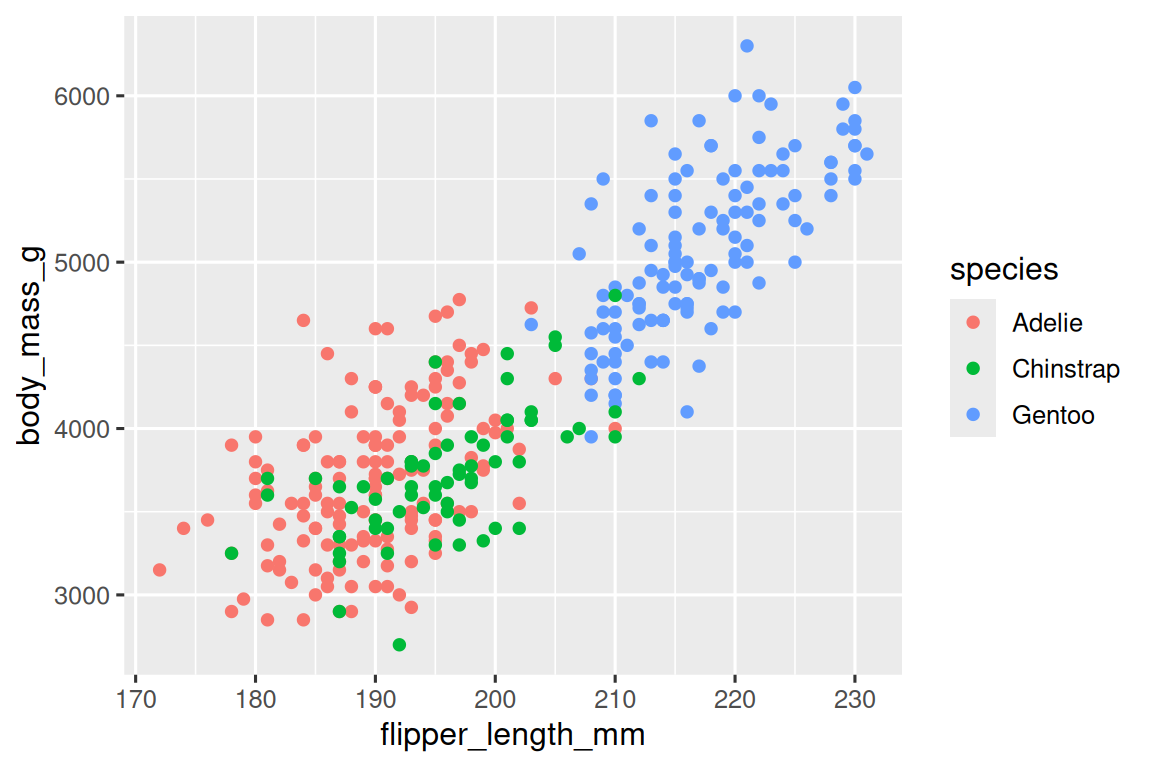
When a categorical variable is mapped to an aesthetic, ggplot2 will automatically assign a unique value of the aesthetic (here a unique color) to each unique level of the variable (each of the three species), a process known as scaling. ggplot2 will also add a legend that explains which values correspond to which levels.
Now let’s add one more layer: a smooth curve displaying the relationship between body mass and flipper length. Before you proceed, refer back to the code above, and think about how we can add this to our existing plot.
Since this is a new geometric object representing our data, we will add a new geom as a layer on top of our point geom: geom_smooth(). And we will specify that we want to draw the line of best fit based on a linear model with method = "lm".
ggplot(
  data = penguins,
  mapping = aes(x = flipper_length_mm, y = body_mass_g, color = species)
) +
  geom_point() +
  geom_smooth(method = "lm")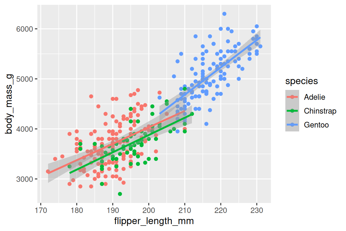
We have successfully added lines, but this plot doesn’t look like the plot from Section 1.2.2, which only has one line for the entire dataset as opposed to separate lines for each of the penguin species.
When aesthetic mappings are defined in ggplot(), at the global level, they’re passed down to each of the subsequent geom layers of the plot. However, each geom function in ggplot2 can also take a mapping argument, which allows for aesthetic mappings at the local level that are added to those inherited from the global level. Since we want points to be colored based on species but don’t want the lines to be separated out for them, we should specify color = species for geom_point() only.
ggplot(
  data = penguins,
  mapping = aes(x = flipper_length_mm, y = body_mass_g)
) +
  geom_point(mapping = aes(color = species)) +
  geom_smooth(method = "lm")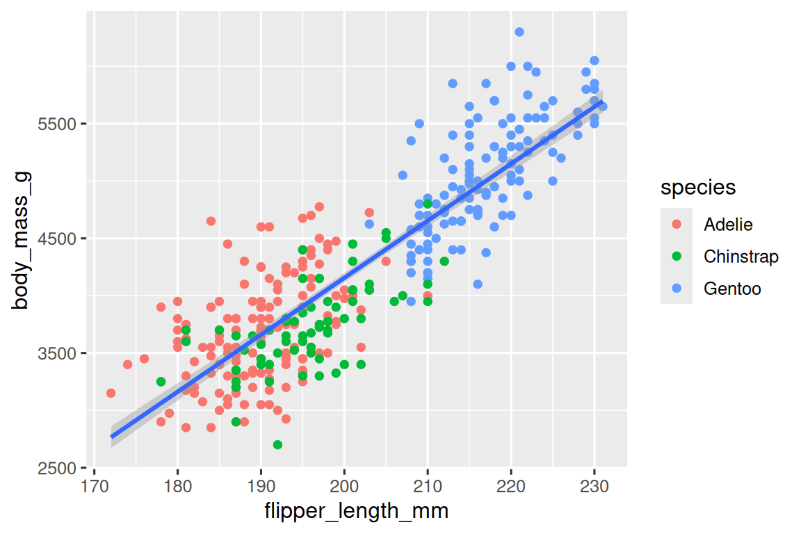
Voila! We have something that looks very much like our ultimate goal, though it’s not yet perfect. We still need to use different shapes for each species of penguins and improve labels.
It’s generally not a good idea to represent information using only colors on a plot, as people perceive colors differently due to color blindness or other color vision differences. Therefore, in addition to color, we can also map species to the shape aesthetic.
ggplot(
  data = penguins,
  mapping = aes(x = flipper_length_mm, y = body_mass_g)
) +
  geom_point(mapping = aes(color = species, shape = species)) +
  geom_smooth(method = "lm")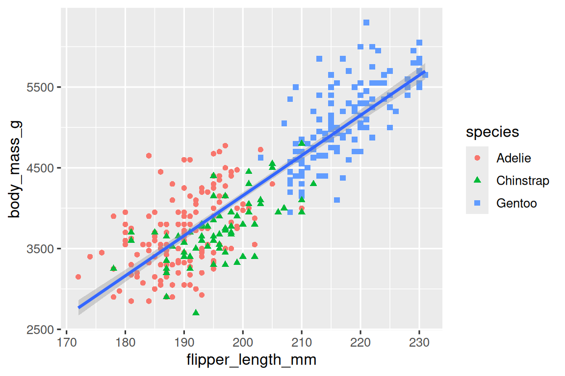
Note that the legend is automatically updated to reflect the different shapes of the points as well.
And finally, we can improve the labels of our plot using the labs() function in a new layer. Some of the arguments to labs() might be self explanatory: title adds a title and subtitle adds a subtitle to the plot. Other arguments match the aesthetic mappings, x is the x-axis label, y is the y-axis label, and color and shape define the label for the legend. In addition, we can improve the color palette to be colorblind safe with the scale_color_colorblind() function from the ggthemes package.
ggplot(
  data = penguins,
  mapping = aes(x = flipper_length_mm, y = body_mass_g)
) +
  geom_point(aes(color = species, shape = species)) +
  geom_smooth(method = "lm") +
  labs(
    title = "Body mass and flipper length",
    subtitle = "Dimensions for Adelie, Chinstrap, and Gentoo Penguins",
    x = "Flipper length (mm)", y = "Body mass (g)",
    color = "Species", shape = "Species"
  ) +
  scale_color_colorblind()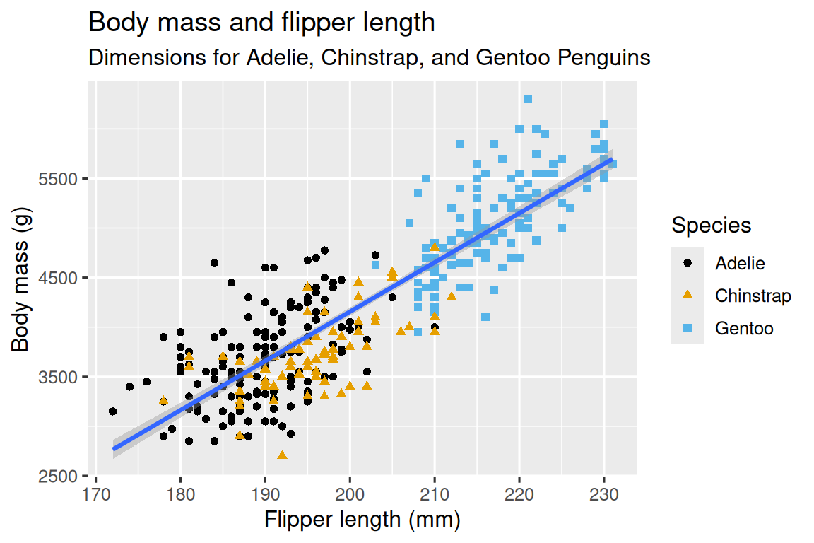
We finally have a plot that perfectly matches our “ultimate goal”!
1.2.5 Exercises
How many rows are in
penguins? How many columns?What does the
bill_depth_mmvariable in thepenguinsdata frame describe? Read the help for?penguinsto find out.Make a scatterplot of
bill_depth_mmvs.bill_length_mm. That is, make a scatterplot withbill_depth_mmon the y-axis andbill_length_mmon the x-axis. Describe the relationship between these two variables.What happens if you make a scatterplot of
speciesvs.bill_depth_mm? What might be a better choice of geom?-
Why does the following give an error and how would you fix it?
ggplot(data = penguins) +
  geom_point()
What does the
na.rmargument do ingeom_point()? What is the default value of the argument? Create a scatterplot where you successfully use this argument set toTRUE.Add the following caption to the plot you made in the previous exercise: “Data come from the palmerpenguins package.” Hint: Take a look at the documentation for
labs().-
Recreate the following visualization. What aesthetic should
bill_depth_mmbe mapped to? And should it be mapped at the global level or at the geom level?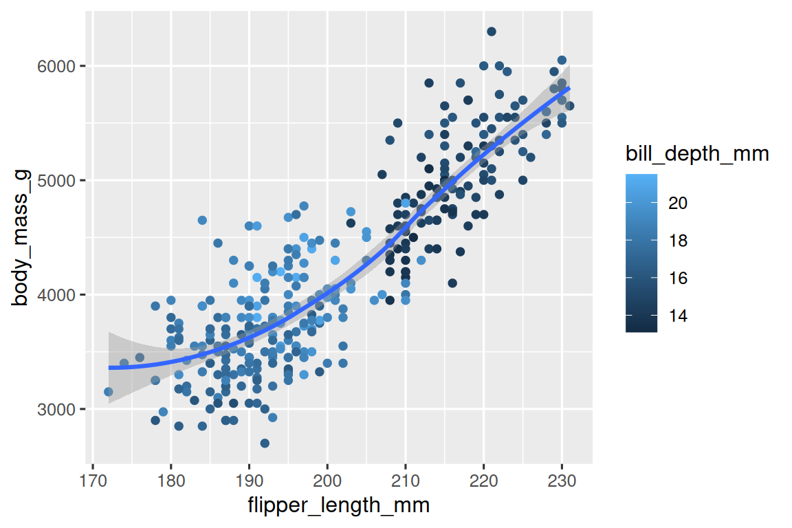
-
Run this code in your head and predict what the output will look like. Then, run the code in R and check your predictions.
ggplot( data = penguins, mapping = aes(x = flipper_length_mm, y = body_mass_g, color = island) ) + geom_point() + geom_smooth(se = FALSE) -
Will these two graphs look different? Why/why not?
ggplot(
  data = penguins,
  mapping = aes(x = flipper_length_mm, y = body_mass_g)
) +
  geom_point() +
  geom_smooth()

ggplot() +
  geom_point(
    data = penguins,
    mapping = aes(x = flipper_length_mm, y = body_mass_g)
  ) +
  geom_smooth(
    data = penguins,
    mapping = aes(x = flipper_length_mm, y = body_mass_g)
  )
1.3 ggplot2 calls
As we move on from these introductory sections, we’ll transition to a more concise expression of ggplot2 code. So far we’ve been very explicit, which is helpful when you are learning:
ggplot(
  data = penguins,
  mapping = aes(x = flipper_length_mm, y = body_mass_g)
) +
  geom_point()
Typically, the first one or two arguments to a function are so important that you should know them by heart. The first two arguments to ggplot() are data and mapping, in the remainder of the book, we won’t supply those names. That saves typing, and, by reducing the amount of extra text, makes it easier to see what’s different between plots. That’s a really important programming concern that we’ll come back to in Chapter 25.
Rewriting the previous plot more concisely yields:
ggplot(penguins, aes(x = flipper_length_mm, y = body_mass_g)) +
  geom_point()
In the future, you’ll also learn about the pipe, |>, which will allow you to create that plot with:
penguins |>
  ggplot(aes(x = flipper_length_mm, y = body_mass_g)) +
  geom_point()
1.4 Visualizing distributions
How you visualize the distribution of a variable depends on the type of variable: categorical or numerical.
1.4.1 A categorical variable
A variable is categorical if it can only take one of a small set of values. To examine the distribution of a categorical variable, you can use a bar chart. The height of the bars displays how many observations occurred with each x value.
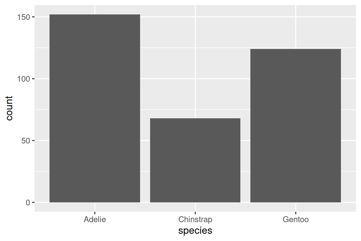
In bar plots of categorical variables with non-ordered levels, like the penguin species above, it’s often preferable to reorder the bars based on their frequencies. Doing so requires transforming the variable to a factor (how R handles categorical data) and then reordering the levels of that factor.
ggplot(penguins, aes(x = fct_infreq(species))) +
  geom_bar()
You will learn more about factors and functions for dealing with factors (like fct_infreq() shown above) in Chapter 16.
1.4.2 A numerical variable
A variable is numerical (or quantitative) if it can take on a wide range of numerical values, and it is sensible to add, subtract, or take averages with those values. Numerical variables can be continuous or discrete.
One commonly used visualization for distributions of continuous variables is a histogram.
ggplot(penguins, aes(x = body_mass_g)) +
  geom_histogram(binwidth = 200)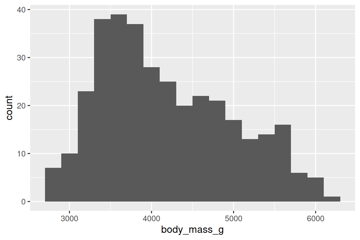
A histogram divides the x-axis into equally spaced bins and then uses the height of a bar to display the number of observations that fall in each bin. In the graph above, the tallest bar shows that 39 observations have a body_mass_g value between 3,500 and 3,700 grams, which are the left and right edges of the bar.
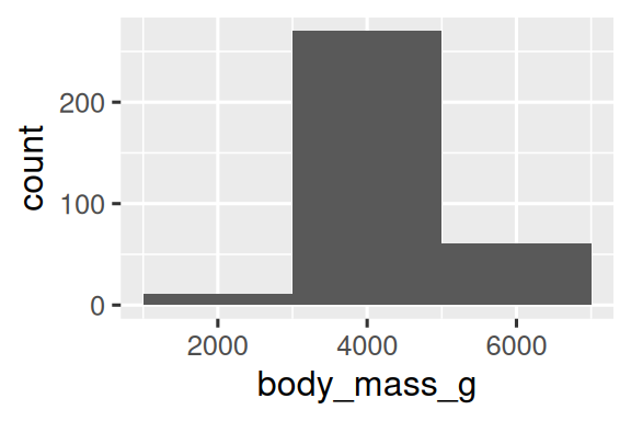
You can set the width of the intervals in a histogram with the binwidth argument, which is measured in the units of the x variable. You should always explore a variety of binwidths when working with histograms, as different binwidths can reveal different patterns. In the plots below a binwidth of 20 is too narrow, resulting in too many bars, making it difficult to determine the shape of the distribution. Similarly, a binwidth of 2,000 is too high, resulting in all data being binned into only three bars, and also making it difficult to determine the shape of the distribution. A binwidth of 200 provides a sensible balance.
ggplot(penguins, aes(x = body_mass_g)) +
  geom_histogram(binwidth = 20)
ggplot(penguins, aes(x = body_mass_g)) +
  geom_histogram(binwidth = 2000)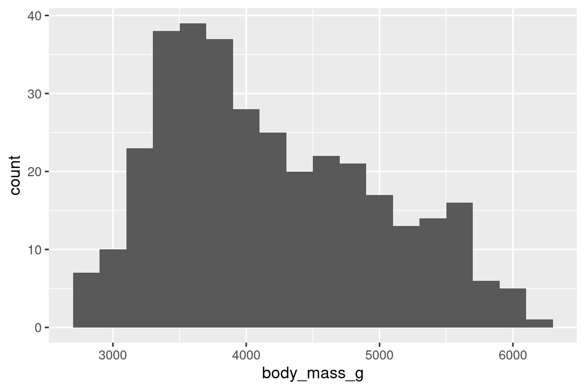
An alternative visualization for distributions of numerical variables is a density plot. A density plot is a smoothed-out version of a histogram and a practical alternative, particularly for continuous data that comes from an underlying smooth distribution. We won’t go into how geom_density() estimates the density (you can read more about that in the function documentation), but let’s explain how the density curve is drawn with an analogy. Imagine a histogram made out of wooden blocks. Then, imagine that you drop a cooked spaghetti string over it. The shape the spaghetti will take draped over blocks can be thought of as the shape of the density curve. It shows fewer details than a histogram but can make it easier to quickly glean the shape of the distribution, particularly with respect to modes and skewness.
ggplot(penguins, aes(x = body_mass_g)) +
  geom_density()
#> Warning: Removed 2 rows containing non-finite outside the scale range
#> (`stat_density()`).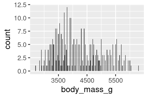
1.4.3 Exercises
Make a bar plot of
speciesofpenguins, where you assignspeciesto theyaesthetic. How is this plot different?-
How are the following two plots different? Which aesthetic,
colororfill, is more useful for changing the color of bars? What does the
binsargument ingeom_histogram()do?Make a histogram of the
caratvariable in thediamondsdataset that is available when you load the tidyverse package. Experiment with different binwidths. What binwidth reveals the most interesting patterns?
1.5 Visualizing relationships
To visualize a relationship we need to have at least two variables mapped to aesthetics of a plot. In the following sections you will learn about commonly used plots for visualizing relationships between two or more variables and the geoms used for creating them.
1.5.1 A numerical and a categorical variable
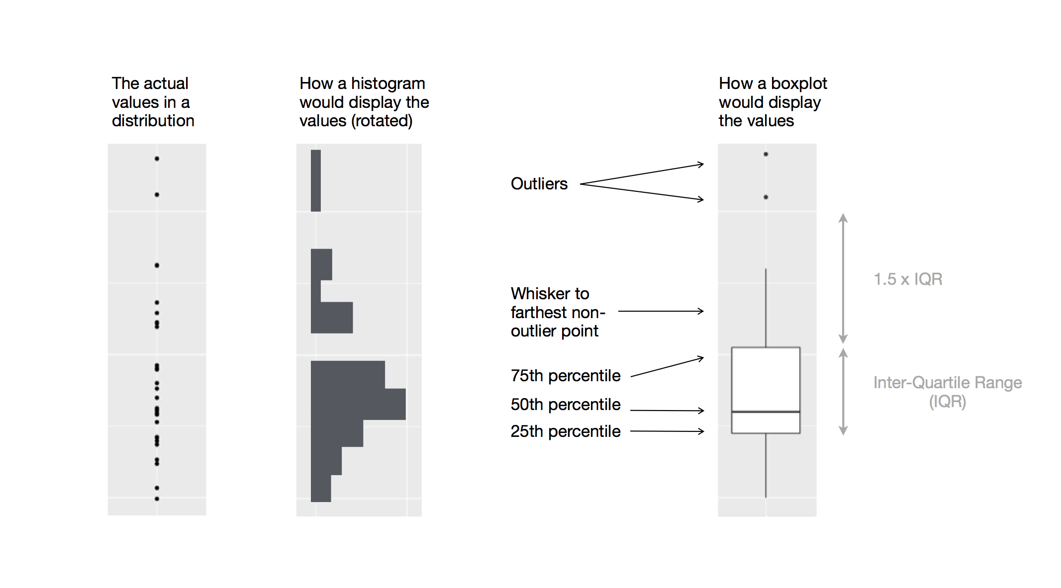
To visualize the relationship between a numerical and a categorical variable we can use side-by-side box plots. A boxplot is a type of visual shorthand for measures of position (percentiles) that describe a distribution. It is also useful for identifying potential outliers. As shown in Figure 1.1, each boxplot consists of:
A box that indicates the range of the middle half of the data, a distance known as the interquartile range (IQR), stretching from the 25th percentile of the distribution to the 75th percentile. In the middle of the box is a line that displays the median, i.e. 50th percentile, of the distribution. These three lines give you a sense of the spread of the distribution and whether or not the distribution is symmetric about the median or skewed to one side.
Visual points that display observations that fall more than 1.5 times the IQR from either edge of the box. These outlying points are unusual so are plotted individually.
A line (or whisker) that extends from each end of the box and goes to the farthest non-outlier point in the distribution.
Let’s take a look at the distribution of body mass by species using geom_boxplot():
ggplot(penguins, aes(x = species, y = body_mass_g)) +
  geom_boxplot()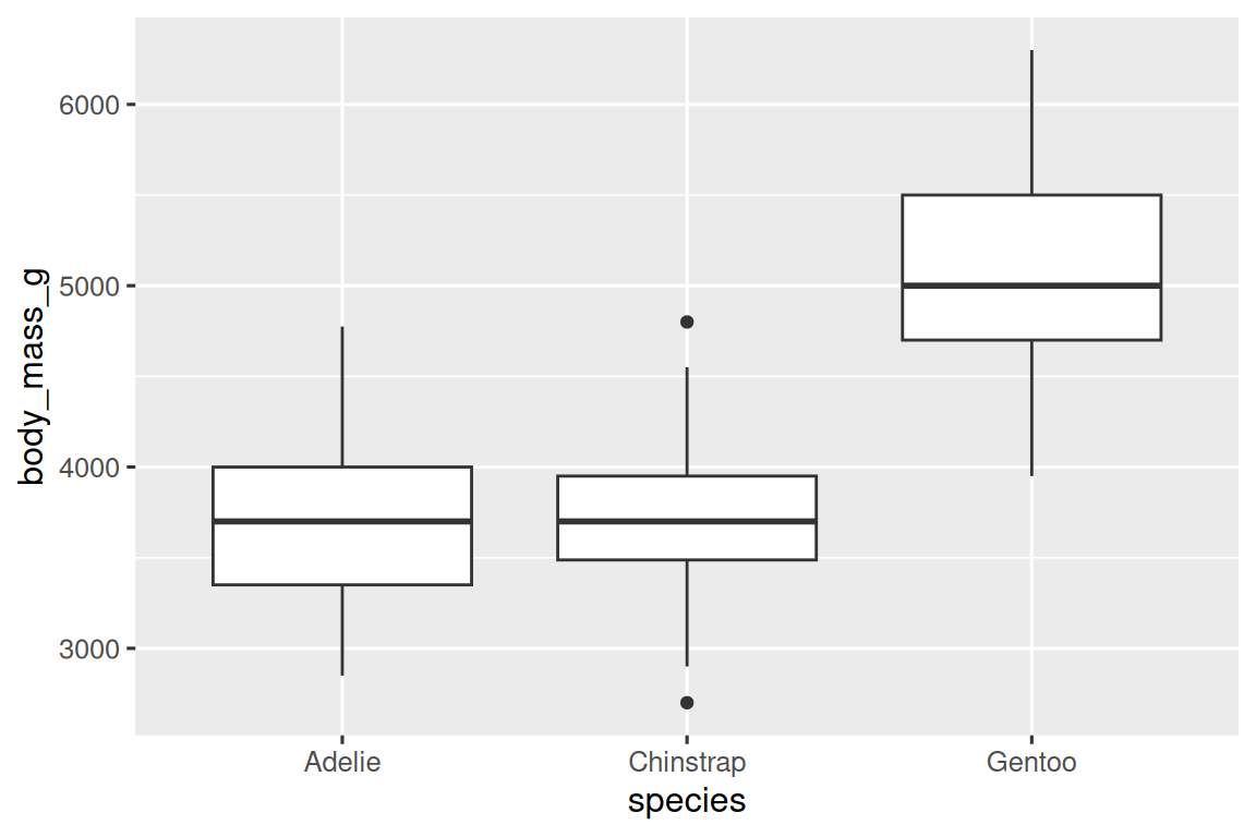
Alternatively, we can make density plots with geom_density().
ggplot(penguins, aes(x = body_mass_g, color = species)) +
  geom_density(linewidth = 0.75)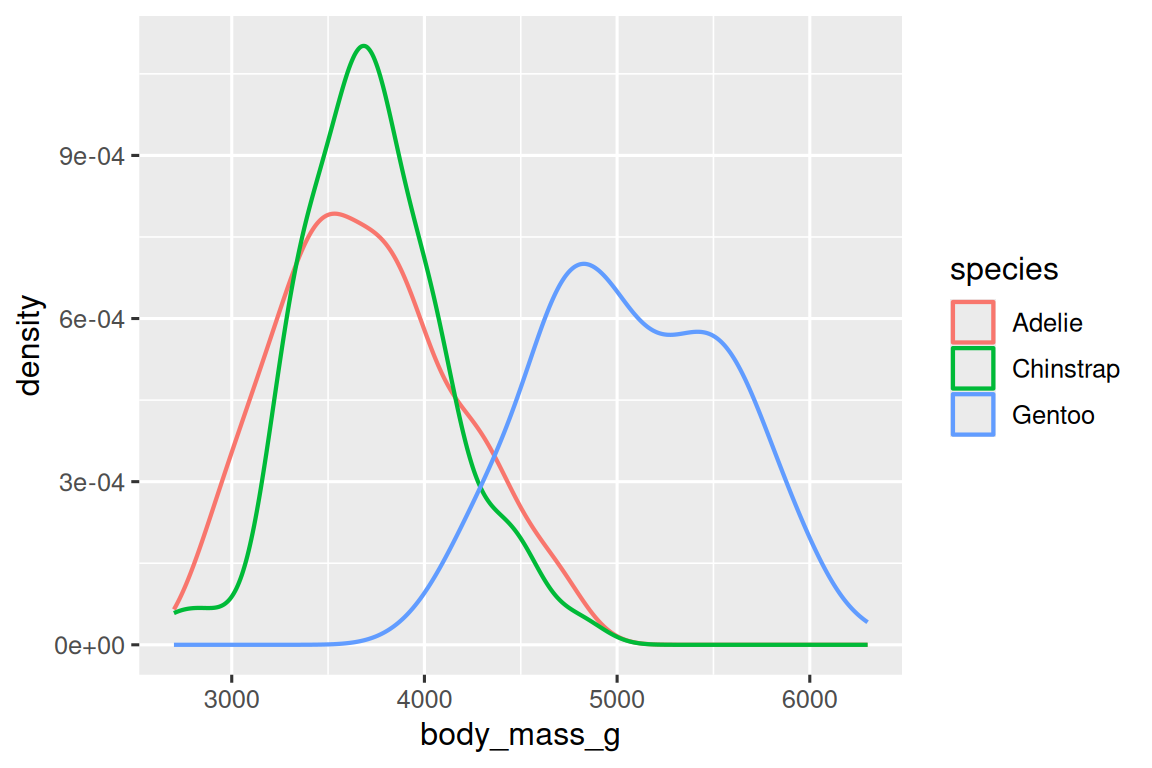
We’ve also customized the thickness of the lines using the linewidth argument in order to make them stand out a bit more against the background.
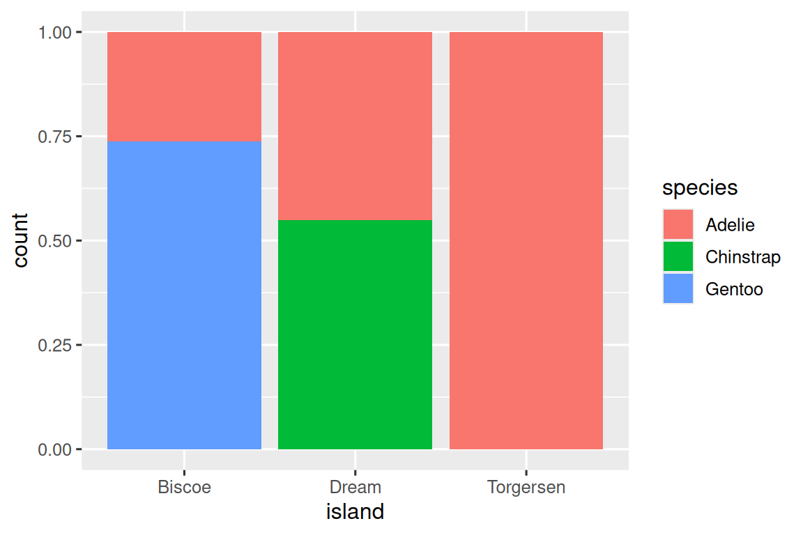
Additionally, we can map species to both color and fill aesthetics and use the alpha aesthetic to add transparency to the filled density curves. This aesthetic takes values between 0 (completely transparent) and 1 (completely opaque). In the following plot it’s set to 0.5.
ggplot(penguins, aes(x = body_mass_g, color = species, fill = species)) +
  geom_density(alpha = 0.5)
Note the terminology we have used here:
- We map variables to aesthetics if we want the visual attribute represented by that aesthetic to vary based on the values of that variable.
- Otherwise, we set the value of an aesthetic.
1.5.2 Two categorical variables
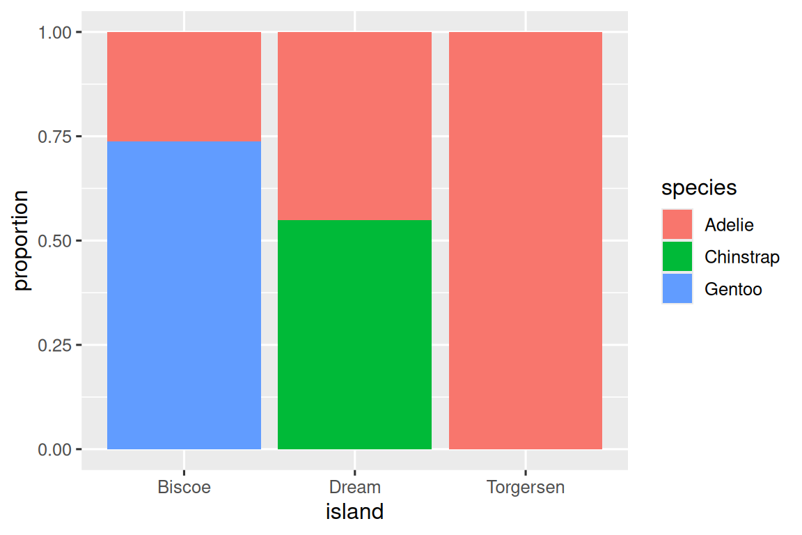
We can use stacked bar plots to visualize the relationship between two categorical variables. For example, the following two stacked bar plots both display the relationship between island and species, or specifically, visualizing the distribution of species within each island.
The first plot shows the frequencies of each species of penguins on each island. The plot of frequencies shows that there are equal numbers of Adelies on each island. But we don’t have a good sense of the percentage balance within each island.

The second plot, a relative frequency plot created by setting position = "fill" in the geom, is more useful for comparing species distributions across islands since it’s not affected by the unequal numbers of penguins across the islands. Using this plot we can see that Gentoo penguins all live on Biscoe island and make up roughly 75% of the penguins on that island, Chinstrap all live on Dream island and make up roughly 50% of the penguins on that island, and Adelie live on all three islands and make up all of the penguins on Torgersen.
In creating these bar charts, we map the variable that will be separated into bars to the x aesthetic, and the variable that will change the colors inside the bars to the fill aesthetic. Unfortunately, ggplot2 labels the y-axis "count" by default, but this is something we can override by adding a labs() layer where we specify the y-axis label as "proportion".
1.5.3 Two numerical variables
So far you’ve learned about scatterplots (created with geom_point()) and smooth curves (created with geom_smooth()) for visualizing the relationship between two numerical variables. A scatterplot is probably the most commonly used plot for visualizing the relationship between two numerical variables.
ggplot(penguins, aes(x = flipper_length_mm, y = body_mass_g)) +
  geom_point()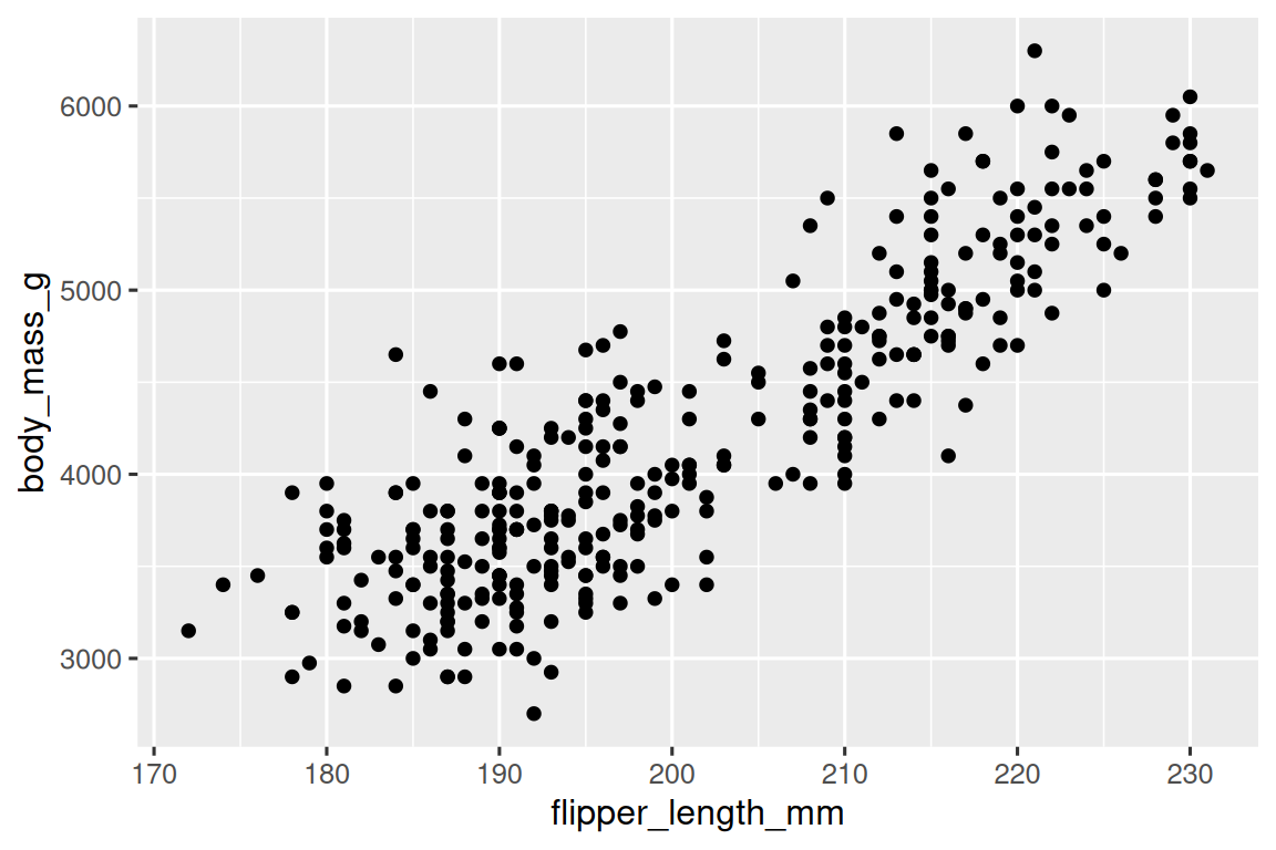
1.5.4 Three or more variables
As we saw in Section 1.2.4, we can incorporate more variables into a plot by mapping them to additional aesthetics. For example, in the following scatterplot the colors of points represent species and the shapes of points represent islands.
ggplot(penguins, aes(x = flipper_length_mm, y = body_mass_g)) +
  geom_point(aes(color = species, shape = island))
However adding too many aesthetic mappings to a plot makes it cluttered and difficult to make sense of. Another way, which is particularly useful for categorical variables, is to split your plot into facets, subplots that each display one subset of the data.
To facet your plot by a single variable, use facet_wrap(). The first argument of facet_wrap() is a formula3, which you create with ~ followed by a variable name. The variable that you pass to facet_wrap() should be categorical.
ggplot(penguins, aes(x = flipper_length_mm, y = body_mass_g)) +
  geom_point(aes(color = species, shape = species)) +
  facet_wrap(~island)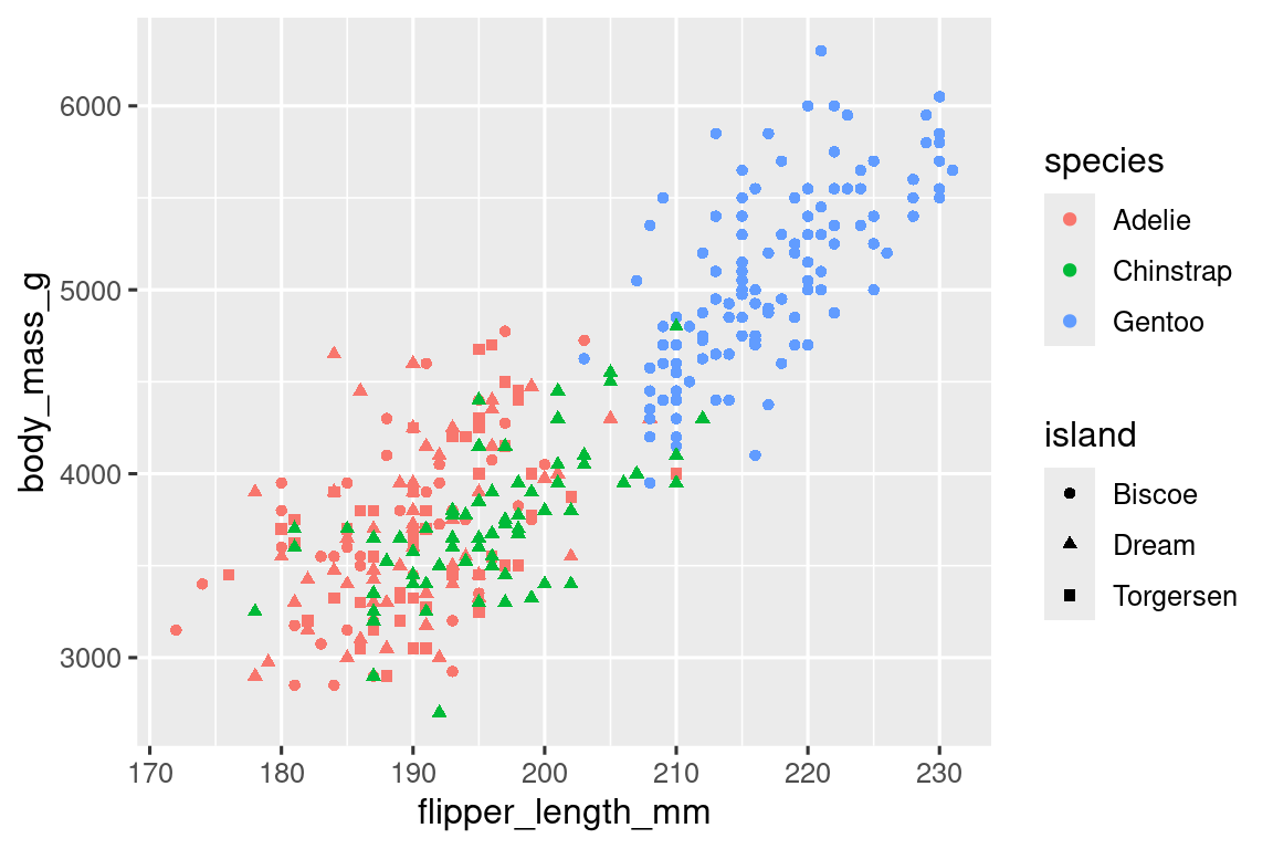
You will learn about many other geoms for visualizing distributions of variables and relationships between them in Chapter 9.
1.5.5 Exercises
The
mpgdata frame that is bundled with the ggplot2 package contains 234 observations collected by the US Environmental Protection Agency on 38 car models. Which variables inmpgare categorical? Which variables are numerical? (Hint: Type?mpgto read the documentation for the dataset.) How can you see this information when you runmpg?Make a scatterplot of
hwyvs.displusing thempgdata frame. Next, map a third, numerical variable tocolor, thensize, then bothcolorandsize, thenshape. How do these aesthetics behave differently for categorical vs. numerical variables?In the scatterplot of
hwyvs.displ, what happens if you map a third variable tolinewidth?What happens if you map the same variable to multiple aesthetics?
Make a scatterplot of
bill_depth_mmvs.bill_length_mmand color the points byspecies. What does adding coloring by species reveal about the relationship between these two variables? What about faceting byspecies?-
Why does the following yield two separate legends? How would you fix it to combine the two legends?
ggplot( data = penguins, mapping = aes( x = bill_length_mm, y = bill_depth_mm, color = species, shape = species ) ) + geom_point() + labs(color = "Species") -
Create the two following stacked bar plots. Which question can you answer with the first one? Which question can you answer with the second one?
1.6 Saving your plots
Once you’ve made a plot, you might want to get it out of R by saving it as an image that you can use elsewhere. That’s the job of ggsave(), which will save the plot most recently created to disk:
ggplot(penguins, aes(x = flipper_length_mm, y = body_mass_g)) +
  geom_point()
ggsave(filename = "penguin-plot.png")
This will save your plot to your working directory, a concept you’ll learn more about in Chapter 6.
If you don’t specify the width and height they will be taken from the dimensions of the current plotting device. For reproducible code, you’ll want to specify them. You can learn more about ggsave() in the documentation.
Generally, however, we recommend that you assemble your final reports using Quarto, a reproducible authoring system that allows you to interleave your code and your prose and automatically include your plots in your write-ups. You will learn more about Quarto in Chapter 28.
1.6.1 Exercises
-
Run the following lines of code. Which of the two plots is saved as
mpg-plot.png? Why? What do you need to change in the code above to save the plot as a PDF instead of a PNG? How could you find out what types of image files would work in
ggsave()?
1.7 Common problems
As you start to run R code, you’re likely to run into problems. Don’t worry — it happens to everyone. We have all been writing R code for years, but every day we still write code that doesn’t work on the first try!
Start by carefully comparing the code that you’re running to the code in the book. R is extremely picky, and a misplaced character can make all the difference. Make sure that every ( is matched with a ) and every " is paired with another ". Sometimes you’ll run the code and nothing happens. Check the left-hand of your console: if it’s a +, it means that R doesn’t think you’ve typed a complete expression and it’s waiting for you to finish it. In this case, it’s usually easy to start from scratch again by pressing ESCAPE to abort processing the current command.
One common problem when creating ggplot2 graphics is to put the + in the wrong place: it has to come at the end of the line, not the start. In other words, make sure you haven’t accidentally written code like this:
ggplot(data = mpg)
+ geom_point(mapping = aes(x = displ, y = hwy))
If you’re still stuck, try the help. You can get help about any R function by running ?function_name in the console, or highlighting the function name and pressing F1 in RStudio. Don’t worry if the help doesn’t seem that helpful - instead skip down to the examples and look for code that matches what you’re trying to do.
If that doesn’t help, carefully read the error message. Sometimes the answer will be buried there! But when you’re new to R, even if the answer is in the error message, you might not yet know how to understand it. Another great tool is Google: try googling the error message, as it’s likely someone else has had the same problem, and has gotten help online.
1.8 Summary
In this chapter, you’ve learned the basics of data visualization with ggplot2. We started with the basic idea that underpins ggplot2: a visualization is a mapping from variables in your data to aesthetic properties like position, color, size and shape. You then learned about increasing the complexity and improving the presentation of your plots layer-by-layer. You also learned about commonly used plots for visualizing the distribution of a single variable as well as for visualizing relationships between two or more variables, by leveraging additional aesthetic mappings and/or splitting your plot into small multiples using faceting.
We’ll use visualizations again and again throughout this book, introducing new techniques as we need them as well as do a deeper dive into creating visualizations with ggplot2 in Chapter 9 through Chapter 11.
With the basics of visualization under your belt, in the next chapter we’re going to switch gears a little and give you some practical workflow advice. We intersperse workflow advice with data science tools throughout this part of the book because it’ll help you stay organized as you write increasing amounts of R code.
You can eliminate that message and force conflict resolution to happen on demand by using the conflicted package, which becomes more important as you load more packages. You can learn more about conflicted at https://conflicted.r-lib.org.↩︎
Horst AM, Hill AP, Gorman KB (2020). palmerpenguins: Palmer Archipelago (Antarctica) penguin data. R package version 0.1.0. https://allisonhorst.github.io/palmerpenguins/. doi: 10.5281/zenodo.3960218.↩︎
Here “formula” is the name of the thing created by
~, not a synonym for “equation”.↩︎