10 Exploratory data analysis
10.1 Introduction
This chapter will show you how to use visualization and transformation to explore your data in a systematic way, a task that statisticians call exploratory data analysis, or EDA for short. EDA is an iterative cycle. You:
Generate questions about your data.
Search for answers by visualizing, transforming, and modelling your data.
Use what you learn to refine your questions and/or generate new questions.
EDA is not a formal process with a strict set of rules. More than anything, EDA is a state of mind. During the initial phases of EDA you should feel free to investigate every idea that occurs to you. Some of these ideas will pan out, and some will be dead ends. As your exploration continues, you will home in on a few particularly productive insights that you’ll eventually write up and communicate to others.
EDA is an important part of any data analysis, even if the primary research questions are handed to you on a platter, because you always need to investigate the quality of your data. Data cleaning is just one application of EDA: you ask questions about whether your data meets your expectations or not. To do data cleaning, you’ll need to deploy all the tools of EDA: visualization, transformation, and modelling.
10.1.1 Prerequisites
In this chapter we’ll combine what you’ve learned about dplyr and ggplot2 to interactively ask questions, answer them with data, and then ask new questions.
10.2 Questions
“There are no routine statistical questions, only questionable statistical routines.” — Sir David Cox
“Far better an approximate answer to the right question, which is often vague, than an exact answer to the wrong question, which can always be made precise.” — John Tukey
Your goal during EDA is to develop an understanding of your data. The easiest way to do this is to use questions as tools to guide your investigation. When you ask a question, the question focuses your attention on a specific part of your dataset and helps you decide which graphs, models, or transformations to make.
EDA is fundamentally a creative process. And like most creative processes, the key to asking quality questions is to generate a large quantity of questions. It is difficult to ask revealing questions at the start of your analysis because you do not know what insights can be gleaned from your dataset. On the other hand, each new question that you ask will expose you to a new aspect of your data and increase your chance of making a discovery. You can quickly drill down into the most interesting parts of your data—and develop a set of thought-provoking questions—if you follow up each question with a new question based on what you find.
There is no rule about which questions you should ask to guide your research. However, two types of questions will always be useful for making discoveries within your data. You can loosely word these questions as:
What type of variation occurs within my variables?
What type of covariation occurs between my variables?
The rest of this chapter will look at these two questions. We’ll explain what variation and covariation are, and we’ll show you several ways to answer each question.
10.3 Variation
Variation is the tendency of the values of a variable to change from measurement to measurement. You can see variation easily in real life; if you measure any continuous variable twice, you will get two different results. This is true even if you measure quantities that are constant, like the speed of light. Each of your measurements will include a small amount of error that varies from measurement to measurement. Variables can also vary if you measure across different subjects (e.g., the eye colors of different people) or at different times (e.g., the energy levels of an electron at different moments). Every variable has its own pattern of variation, which can reveal interesting information about how it varies between measurements on the same observation as well as across observations. The best way to understand that pattern is to visualize the distribution of the variable’s values, which you’ve learned about in Chapter 1.
We’ll start our exploration by visualizing the distribution of weights (carat) of ~54,000 diamonds from the diamonds dataset. Since carat is a numerical variable, we can use a histogram:
ggplot(diamonds, aes(x = carat)) +
  geom_histogram(binwidth = 0.5)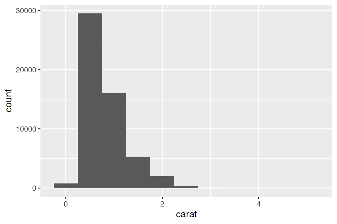
Now that you can visualize variation, what should you look for in your plots? And what type of follow-up questions should you ask? We’ve put together a list below of the most useful types of information that you will find in your graphs, along with some follow-up questions for each type of information. The key to asking good follow-up questions will be to rely on your curiosity (What do you want to learn more about?) as well as your skepticism (How could this be misleading?).
10.3.1 Typical values
In both bar charts and histograms, tall bars show the common values of a variable, and shorter bars show less-common values. Places that do not have bars reveal values that were not seen in your data. To turn this information into useful questions, look for anything unexpected:
Which values are the most common? Why?
Which values are rare? Why? Does that match your expectations?
Can you see any unusual patterns? What might explain them?
Let’s take a look at the distribution of carat for smaller diamonds.
smaller <- diamonds |>
  filter(carat < 3)

ggplot(smaller, aes(x = carat)) +
  geom_histogram(binwidth = 0.01)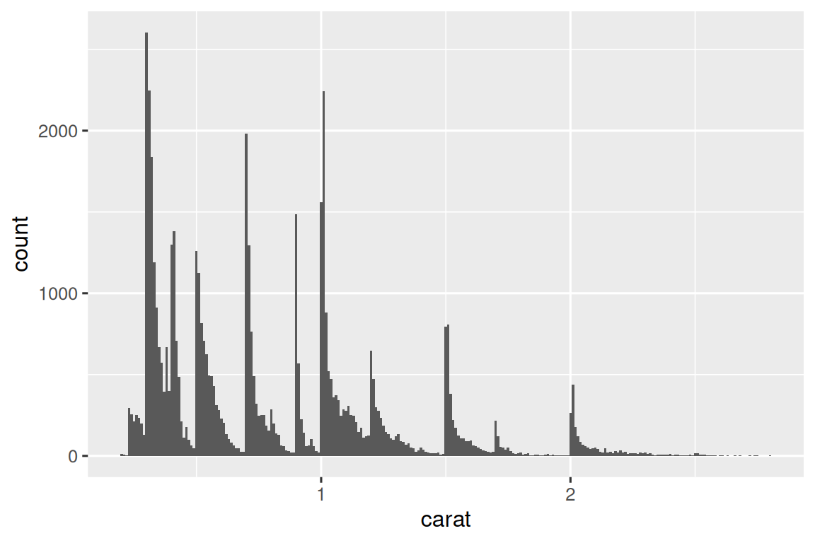
This histogram suggests several interesting questions:
Why are there more diamonds at whole carats and common fractions of carats?
Why are there more diamonds slightly to the right of each peak than there are slightly to the left of each peak?
Visualizations can also reveal clusters, which suggest that subgroups exist in your data. To understand the subgroups, ask:
How are the observations within each subgroup similar to each other?
How are the observations in separate clusters different from each other?
How can you explain or describe the clusters?
Why might the appearance of clusters be misleading?
Some of these questions can be answered with the data while some will require domain expertise about the data. Many of them will prompt you to explore a relationship between variables, for example, to see if the values of one variable can explain the behavior of another variable. We’ll get to that shortly.
10.3.2 Unusual values
Outliers are observations that are unusual; data points that don’t seem to fit the pattern. Sometimes outliers are data entry errors, sometimes they are simply values at the extremes that happened to be observed in this data collection, and other times they suggest important new discoveries. When you have a lot of data, outliers are sometimes difficult to see in a histogram. For example, take the distribution of the y variable from the diamonds dataset. The only evidence of outliers is the unusually wide limits on the x-axis.
ggplot(diamonds, aes(x = y)) +
  geom_histogram(binwidth = 0.5)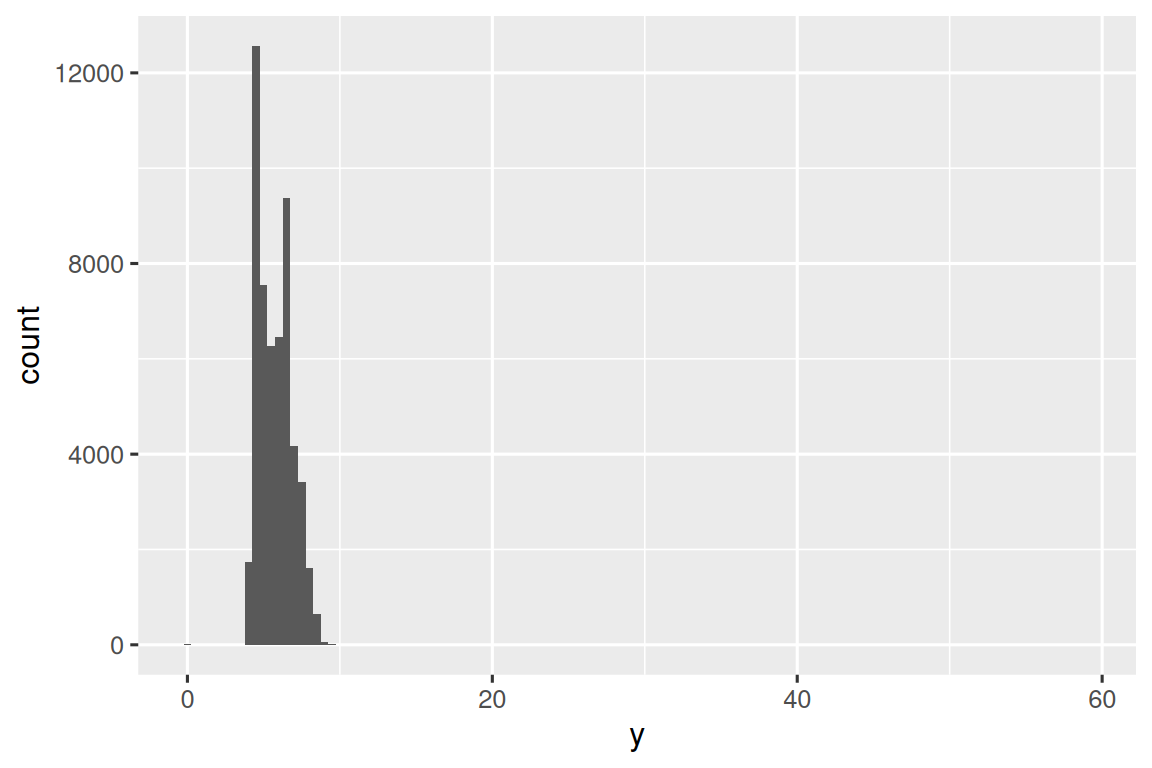
There are so many observations in the common bins that the rare bins are very short, making it very difficult to see them (although maybe if you stare intently at 0 you’ll spot something). To make it easy to see the unusual values, we need to zoom to small values of the y-axis with coord_cartesian():
ggplot(diamonds, aes(x = y)) +
  geom_histogram(binwidth = 0.5) +
  coord_cartesian(ylim = c(0, 50))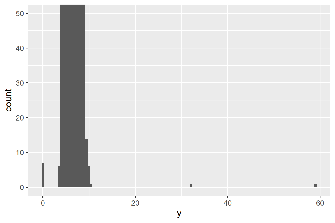
coord_cartesian() also has an xlim() argument for when you need to zoom into the x-axis. ggplot2 also has xlim() and ylim() functions that work slightly differently: they throw away the data outside the limits.
This allows us to see that there are three unusual values: 0, ~30, and ~60. We pluck them out with dplyr:
unusual <- diamonds |>
  filter(y < 3 | y > 20) |>
  select(price, x, y, z) |>
  arrange(y)
unusual
#> # A tibble: 9 × 4
#>   price     x     y     z
#>   <int> <dbl> <dbl> <dbl>
#> 1  5139  0      0    0
#> 2  6381  0      0    0
#> 3 12800  0      0    0
#> 4 15686  0      0    0
#> 5 18034  0      0    0
#> 6  2130  0      0    0
#> 7  2130  0      0    0
#> 8  2075  5.15  31.8  5.12
#> 9 12210  8.09  58.9  8.06
The y variable measures one of the three dimensions of these diamonds, in mm. We know that diamonds can’t have a width of 0mm, so these values must be incorrect. By doing EDA, we have discovered missing data that was coded as 0, which we never would have found by simply searching for NAs. Going forward we might choose to re-code these values as NAs in order to prevent misleading calculations. We might also suspect that measurements of 32mm and 59mm are implausible: those diamonds are over an inch long, but don’t cost hundreds of thousands of dollars!
It’s good practice to repeat your analysis with and without the outliers. If they have minimal effect on the results, and you can’t figure out why they’re there, it’s reasonable to omit them, and move on. However, if they have a substantial effect on your results, you shouldn’t drop them without justification. You’ll need to figure out what caused them (e.g., a data entry error) and disclose that you removed them in your write-up.
10.3.3 Exercises
Explore the distribution of each of the
x,y, andzvariables indiamonds. What do you learn? Think about a diamond and how you might decide which dimension is the length, width, and depth.Explore the distribution of
price. Do you discover anything unusual or surprising? (Hint: Carefully think about thebinwidthand make sure you try a wide range of values.)How many diamonds are 0.99 carat? How many are 1 carat? What do you think is the cause of the difference?
Compare and contrast
coord_cartesian()vs.xlim()orylim()when zooming in on a histogram. What happens if you leavebinwidthunset? What happens if you try and zoom so only half a bar shows?
10.4 Unusual values
If you’ve encountered unusual values in your dataset, and simply want to move on to the rest of your analysis, you have two options.
-
Drop the entire row with the strange values:
We don’t recommend this option because one invalid value doesn’t imply that all the other values for that observation are also invalid. Additionally, if you have low quality data, by the time that you’ve applied this approach to every variable you might find that you don’t have any data left!
-
Instead, we recommend replacing the unusual values with missing values. The easiest way to do this is to use
mutate()to replace the variable with a modified copy. You can use theif_else()function to replace unusual values withNA:
It’s not obvious where you should plot missing values, so ggplot2 doesn’t include them in the plot, but it does warn that they’ve been removed:
ggplot(diamonds2, aes(x = x, y = y)) +
  geom_point()
#> Warning: Removed 9 rows containing missing values or values outside the scale range
#> (`geom_point()`).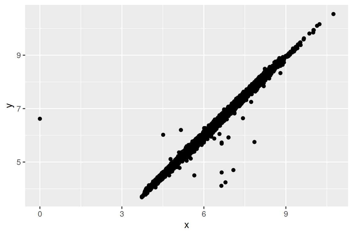
To suppress that warning, set na.rm = TRUE:
ggplot(diamonds2, aes(x = x, y = y)) +
  geom_point(na.rm = TRUE)
Other times you want to understand what makes observations with missing values different to observations with recorded values. For example, in nycflights13::flights1, missing values in the dep_time variable indicate that the flight was cancelled. So you might want to compare the scheduled departure times for cancelled and non-cancelled times. You can do this by making a new variable, using is.na() to check if dep_time is missing.
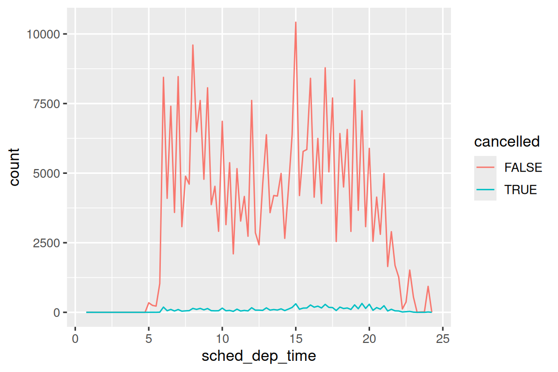
However this plot isn’t great because there are many more non-cancelled flights than cancelled flights. In the next section we’ll explore some techniques for improving this comparison.
10.4.1 Exercises
What happens to missing values in a histogram? What happens to missing values in a bar chart? Why is there a difference in how missing values are handled in histograms and bar charts?
Recreate the frequency plot of
scheduled_dep_timecolored by whether the flight was cancelled or not. Also facet by thecancelledvariable. Experiment with different values of thescalesvariable in the faceting function to mitigate the effect of more non-cancelled flights than cancelled flights.
10.5 Covariation
If variation describes the behavior within a variable, covariation describes the behavior between variables. Covariation is the tendency for the values of two or more variables to vary together in a related way. The best way to spot covariation is to visualize the relationship between two or more variables.
10.5.1 A categorical and a numerical variable
For example, let’s explore how the price of a diamond varies with its quality (measured by cut) using geom_freqpoly():
ggplot(diamonds, aes(x = price)) +
  geom_freqpoly(aes(color = cut), binwidth = 500, linewidth = 0.75)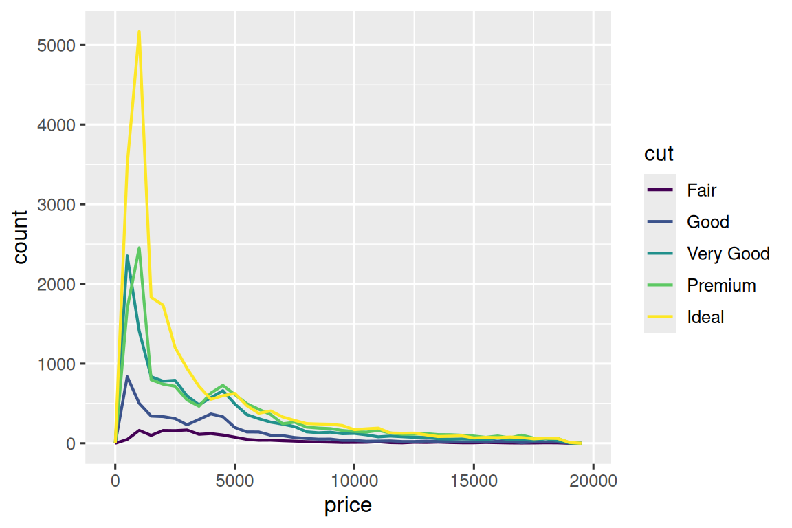
Note that ggplot2 uses an ordered color scale for cut because it’s defined as an ordered factor variable in the data. You’ll learn more about these in Section 16.6.
The default appearance of geom_freqpoly() is not that useful here because the height, determined by the overall count, differs so much across cuts, making it hard to see the differences in the shapes of their distributions.
To make the comparison easier we need to swap what is displayed on the y-axis. Instead of displaying count, we’ll display the density, which is the count standardized so that the area under each frequency polygon is one.
ggplot(diamonds, aes(x = price, y = after_stat(density))) +
  geom_freqpoly(aes(color = cut), binwidth = 500, linewidth = 0.75)
Note that we’re mapping the density to y, but since density is not a variable in the diamonds dataset, we need to first calculate it. We use the after_stat() function to do so.
There’s something rather surprising about this plot - it appears that fair diamonds (the lowest quality) have the highest average price! But maybe that’s because frequency polygons are a little hard to interpret - there’s a lot going on in this plot.
A visually simpler plot for exploring this relationship is using side-by-side boxplots.
ggplot(diamonds, aes(x = cut, y = price)) +
  geom_boxplot()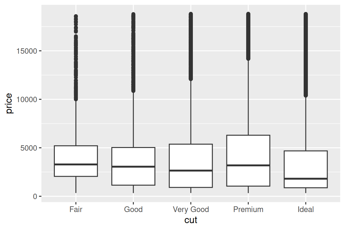
We see much less information about the distribution, but the boxplots are much more compact so we can more easily compare them (and fit more on one plot). It supports the counter-intuitive finding that better quality diamonds are typically cheaper! In the exercises, you’ll be challenged to figure out why.
cut is an ordered factor: fair is worse than good, which is worse than very good and so on. Many categorical variables don’t have such an intrinsic order, so you might want to reorder them to make a more informative display. One way to do that is with fct_reorder(). You’ll learn more about that function in Section 16.4, but we want to give you a quick preview here because it’s so useful. For example, take the class variable in the mpg dataset. You might be interested to know how highway mileage varies across classes:
ggplot(mpg, aes(x = class, y = hwy)) +
  geom_boxplot()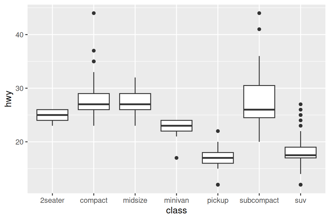
To make the trend easier to see, we can reorder class based on the median value of hwy:
ggplot(mpg, aes(x = fct_reorder(class, hwy, median), y = hwy)) +
  geom_boxplot()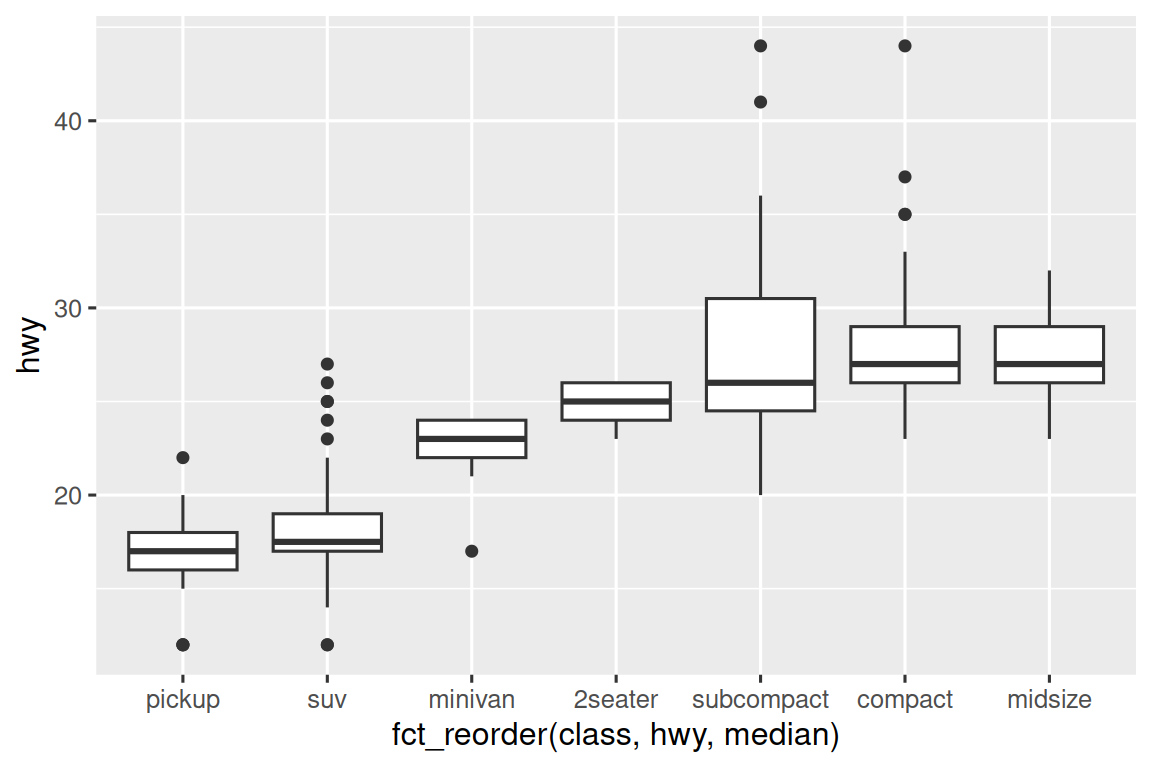
If you have long variable names, geom_boxplot() will work better if you flip it 90°. You can do that by exchanging the x and y aesthetic mappings.
ggplot(mpg, aes(x = hwy, y = fct_reorder(class, hwy, median))) +
  geom_boxplot()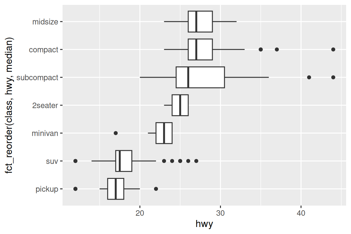
10.5.1.1 Exercises
Use what you’ve learned to improve the visualization of the departure times of cancelled vs. non-cancelled flights.
Based on EDA, what variable in the diamonds dataset appears to be most important for predicting the price of a diamond? How is that variable correlated with cut? Why does the combination of those two relationships lead to lower quality diamonds being more expensive?
Instead of exchanging the x and y variables, add
coord_flip()as a new layer to the vertical boxplot to create a horizontal one. How does this compare to exchanging the variables?One problem with boxplots is that they were developed in an era of much smaller datasets and tend to display a prohibitively large number of “outlying values”. One approach to remedy this problem is the letter value plot. Install the lvplot package, and try using
geom_lv()to display the distribution of price vs. cut. What do you learn? How do you interpret the plots?Create a visualization of diamond prices vs. a categorical variable from the
diamondsdataset usinggeom_violin(), then a facetedgeom_histogram(), then a coloredgeom_freqpoly(), and then a coloredgeom_density(). Compare and contrast the four plots. What are the pros and cons of each method of visualizing the distribution of a numerical variable based on the levels of a categorical variable?If you have a small dataset, it’s sometimes useful to use
geom_jitter()to avoid overplotting to more easily see the relationship between a continuous and categorical variable. The ggbeeswarm package provides a number of methods similar togeom_jitter(). List them and briefly describe what each one does.
10.5.2 Two categorical variables
To visualize the covariation between categorical variables, you’ll need to count the number of observations for each combination of levels of these categorical variables. One way to do that is to rely on the built-in geom_count():
ggplot(diamonds, aes(x = cut, y = color)) +
  geom_count()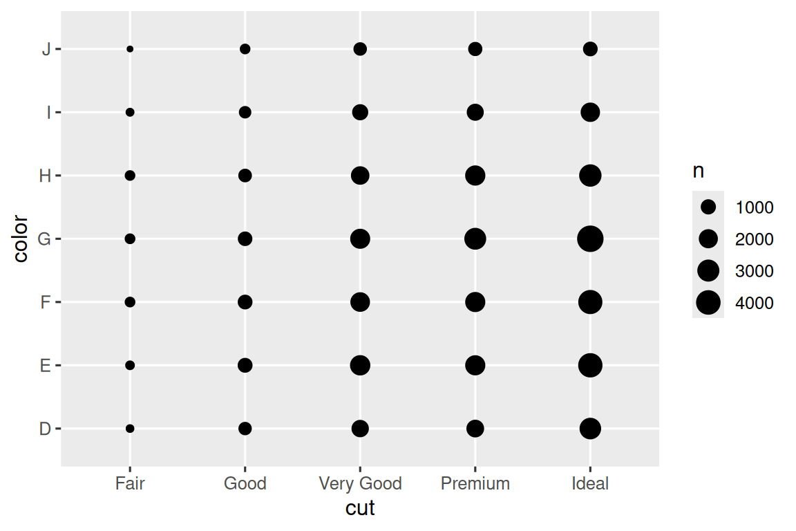
The size of each circle in the plot displays how many observations occurred at each combination of values. Covariation will appear as a strong correlation between specific x values and specific y values.
Another approach for exploring the relationship between these variables is computing the counts with dplyr:
diamonds |>
  count(color, cut)
#> # A tibble: 35 × 3
#>   color cut           n
#>   <ord> <ord>     <int>
#> 1 D     Fair        163
#> 2 D     Good        662
#> 3 D     Very Good  1513
#> 4 D     Premium    1603
#> 5 D     Ideal      2834
#> 6 E     Fair        224
#> # ℹ 29 more rows
Then visualize with geom_tile() and the fill aesthetic:
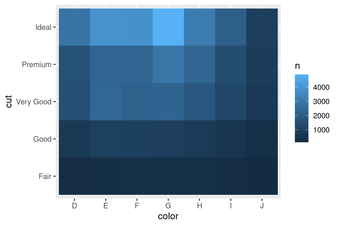
If the categorical variables are unordered, you might want to use the seriation package to simultaneously reorder the rows and columns in order to more clearly reveal interesting patterns. For larger plots, you might want to try the heatmaply package, which creates interactive plots.
10.5.2.1 Exercises
How could you rescale the count dataset above to more clearly show the distribution of cut within color, or color within cut?
What different data insights do you get with a segmented bar chart if color is mapped to the
xaesthetic andcutis mapped to thefillaesthetic? Calculate the counts that fall into each of the segments.Use
geom_tile()together with dplyr to explore how average flight departure delays vary by destination and month of year. What makes the plot difficult to read? How could you improve it?
10.5.3 Two numerical variables
You’ve already seen one great way to visualize the covariation between two numerical variables: draw a scatterplot with geom_point(). You can see covariation as a pattern in the points. For example, you can see a positive relationship between the carat size and price of a diamond: diamonds with more carats have a higher price. The relationship is exponential.
ggplot(smaller, aes(x = carat, y = price)) +
  geom_point()
(In this section we’ll use the smaller dataset to stay focused on the bulk of the diamonds that are smaller than 3 carats)
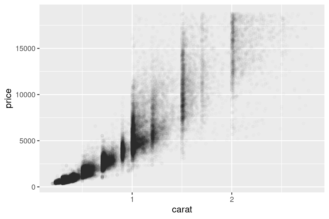
Scatterplots become less useful as the size of your dataset grows, because points begin to overplot, and pile up into areas of uniform black, making it hard to judge differences in the density of the data across the 2-dimensional space as well as making it hard to spot the trend. You’ve already seen one way to fix the problem: using the alpha aesthetic to add transparency.
ggplot(smaller, aes(x = carat, y = price)) +
  geom_point(alpha = 1 / 100)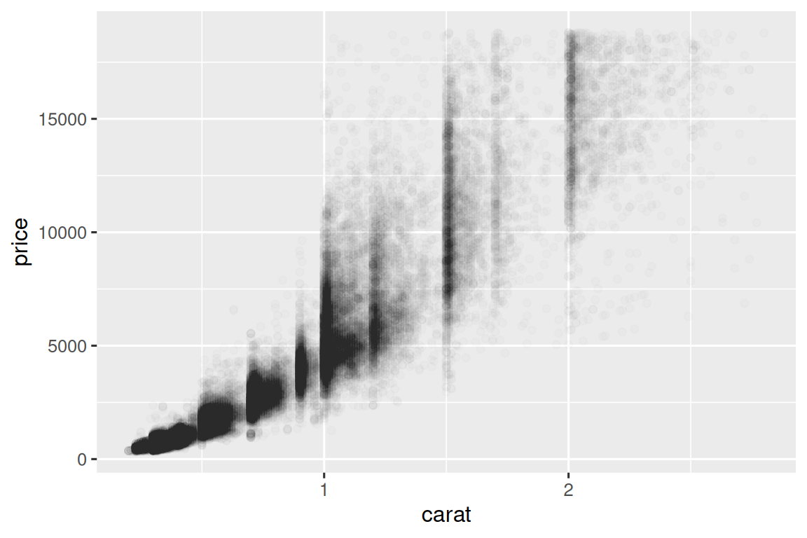
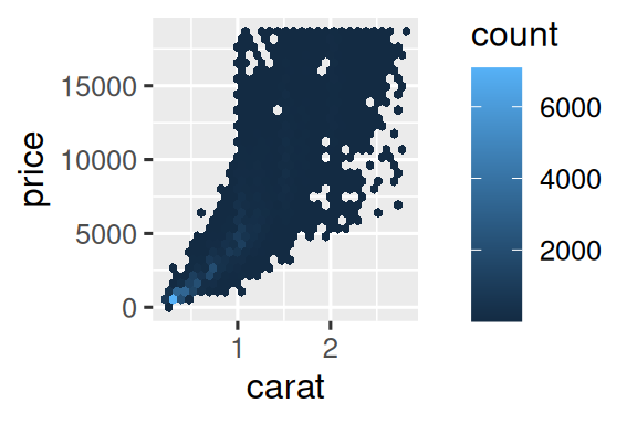
But using transparency can be challenging for very large datasets. Another solution is to use bin. Previously you used geom_histogram() and geom_freqpoly() to bin in one dimension. Now you’ll learn how to use geom_bin2d() and geom_hex() to bin in two dimensions.
geom_bin2d() and geom_hex() divide the coordinate plane into 2d bins and then use a fill color to display how many points fall into each bin. geom_bin2d() creates rectangular bins. geom_hex() creates hexagonal bins. You will need to install the hexbin package to use geom_hex().
Another option is to bin one continuous variable so it acts like a categorical variable. Then you can use one of the techniques for visualizing the combination of a categorical and a continuous variable that you learned about. For example, you could bin carat and then for each group, display a boxplot:
ggplot(smaller, aes(x = carat, y = price)) +
  geom_boxplot(aes(group = cut_width(carat, 0.1)))
#> Warning: Orientation is not uniquely specified when both the x and y aesthetics are
#> continuous. Picking default orientation 'x'.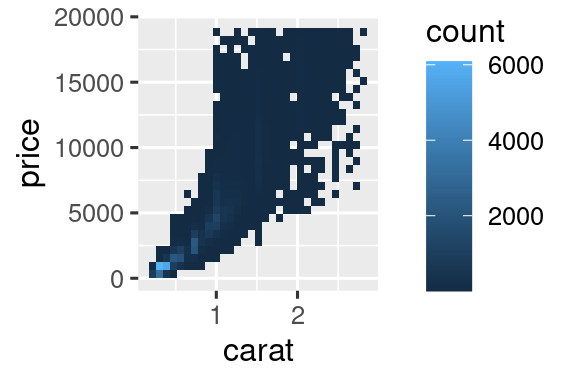
cut_width(x, width), as used above, divides x into bins of width width. By default, boxplots look roughly the same (apart from number of outliers) regardless of how many observations there are, so it’s difficult to tell that each boxplot summarizes a different number of points. One way to show that is to make the width of the boxplot proportional to the number of points with varwidth = TRUE.
10.5.3.1 Exercises
Instead of summarizing the conditional distribution with a boxplot, you could use a frequency polygon. What do you need to consider when using
cut_width()vs.cut_number()? How does that impact a visualization of the 2d distribution ofcaratandprice?Visualize the distribution of
carat, partitioned byprice.How does the price distribution of very large diamonds compare to small diamonds? Is it as you expect, or does it surprise you?
Combine two of the techniques you’ve learned to visualize the combined distribution of cut, carat, and price.
-
Two dimensional plots reveal outliers that are not visible in one dimensional plots. For example, some points in the following plot have an unusual combination of
xandyvalues, which makes the points outliers even though theirxandyvalues appear normal when examined separately. Why is a scatterplot a better display than a binned plot for this case?diamonds |> filter(x >= 4) |> ggplot(aes(x = x, y = y)) + geom_point() + coord_cartesian(xlim = c(4, 11), ylim = c(4, 11)) -
Instead of creating boxes of equal width with
cut_width(), we could create boxes that contain roughly equal number of points withcut_number(). What are the advantages and disadvantages of this approach?ggplot(smaller, aes(x = carat, y = price)) + geom_boxplot(aes(group = cut_number(carat, 20)))
10.6 Patterns and models
If a systematic relationship exists between two variables it will appear as a pattern in the data. If you spot a pattern, ask yourself:
Could this pattern be due to coincidence (i.e. random chance)?
How can you describe the relationship implied by the pattern?
How strong is the relationship implied by the pattern?
What other variables might affect the relationship?
Does the relationship change if you look at individual subgroups of the data?
Patterns in your data provide clues about relationships, i.e., they reveal covariation. If you think of variation as a phenomenon that creates uncertainty, covariation is a phenomenon that reduces it. If two variables covary, you can use the values of one variable to make better predictions about the values of the second. If the covariation is due to a causal relationship (a special case), then you can use the value of one variable to control the value of the second.
Models are a tool for extracting patterns out of data. For example, consider the diamonds data. It’s hard to understand the relationship between cut and price, because cut and carat, and carat and price are tightly related. It’s possible to use a model to remove the very strong relationship between price and carat so we can explore the subtleties that remain. The following code fits a model that predicts price from carat and then computes the residuals (the difference between the predicted value and the actual value). The residuals give us a view of the price of the diamond, once the effect of carat has been removed. Note that instead of using the raw values of price and carat, we log transform them first, and fit a model to the log-transformed values. Then, we exponentiate the residuals to put them back in the scale of raw prices.
library(tidymodels)

diamonds <- diamonds |>
  mutate(
    log_price = log(price),
    log_carat = log(carat)
  )

diamonds_fit <- linear_reg() |>
  fit(log_price ~ log_carat, data = diamonds)

diamonds_aug <- augment(diamonds_fit, new_data = diamonds) |>
  mutate(.resid = exp(.resid))

ggplot(diamonds_aug, aes(x = carat, y = .resid)) +
  geom_point()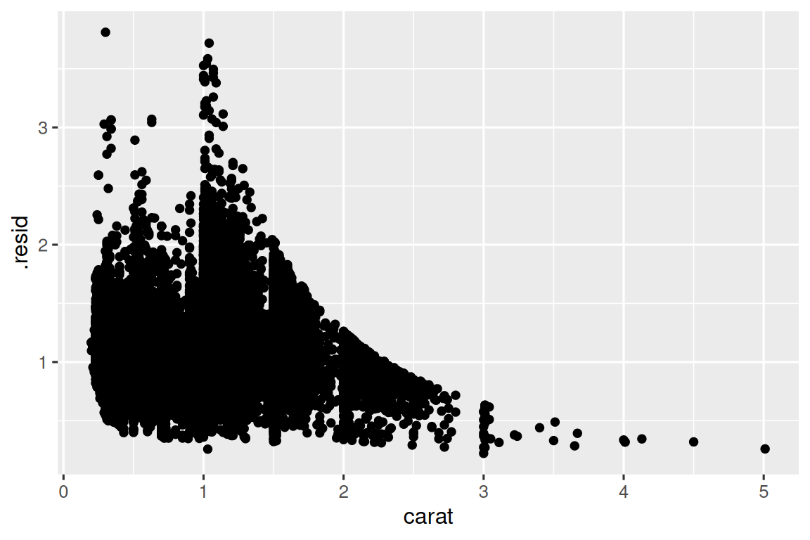
Once you’ve removed the strong relationship between carat and price, you can see what you expect in the relationship between cut and price: relative to their size, better quality diamonds are more expensive.
ggplot(diamonds_aug, aes(x = cut, y = .resid)) +
  geom_boxplot()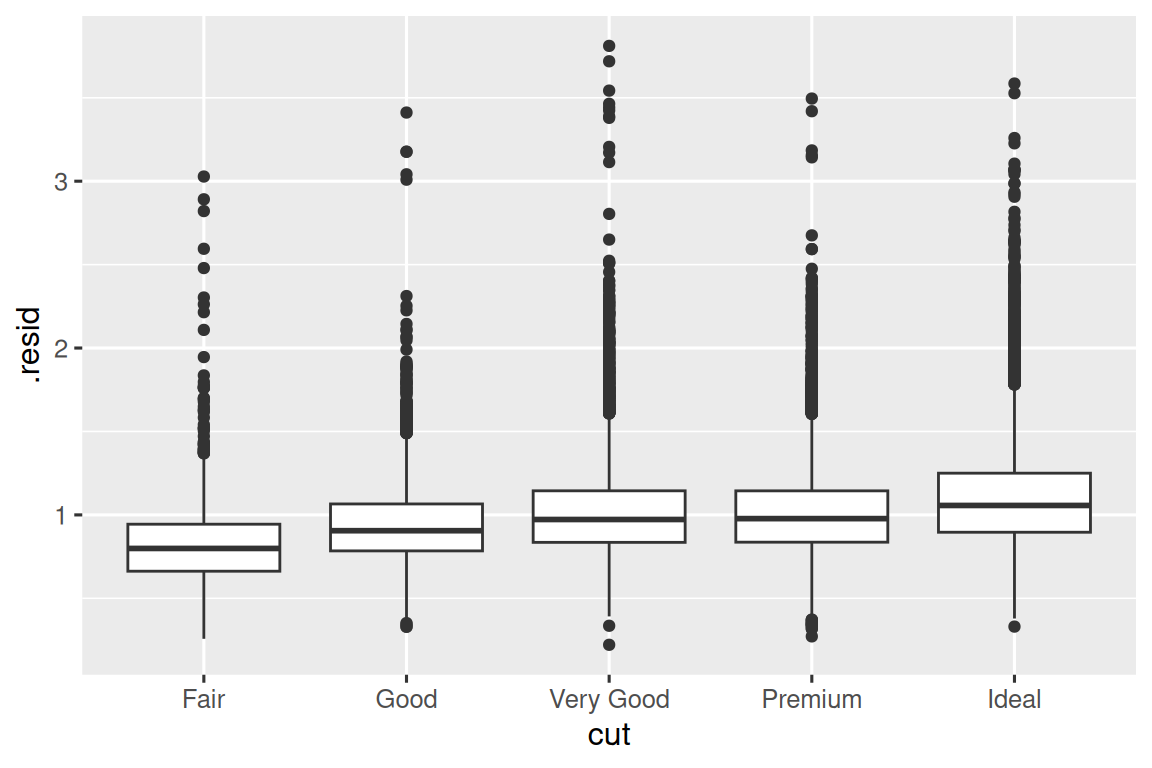
We’re not discussing modelling in this book because understanding what models are and how they work is easiest once you have tools of data wrangling and programming in hand.
10.7 Summary
In this chapter you’ve learned a variety of tools to help you understand the variation within your data. You’ve seen techniques that work with a single variable at a time and with a pair of variables. This might seem painfully restrictive if you have tens or hundreds of variables in your data, but they’re the foundation upon which all other techniques are built.
In the next chapter, we’ll focus on the tools we can use to communicate our results.
Remember that when we need to be explicit about where a function (or dataset) comes from, we’ll use the special form
package::function()orpackage::dataset.↩︎