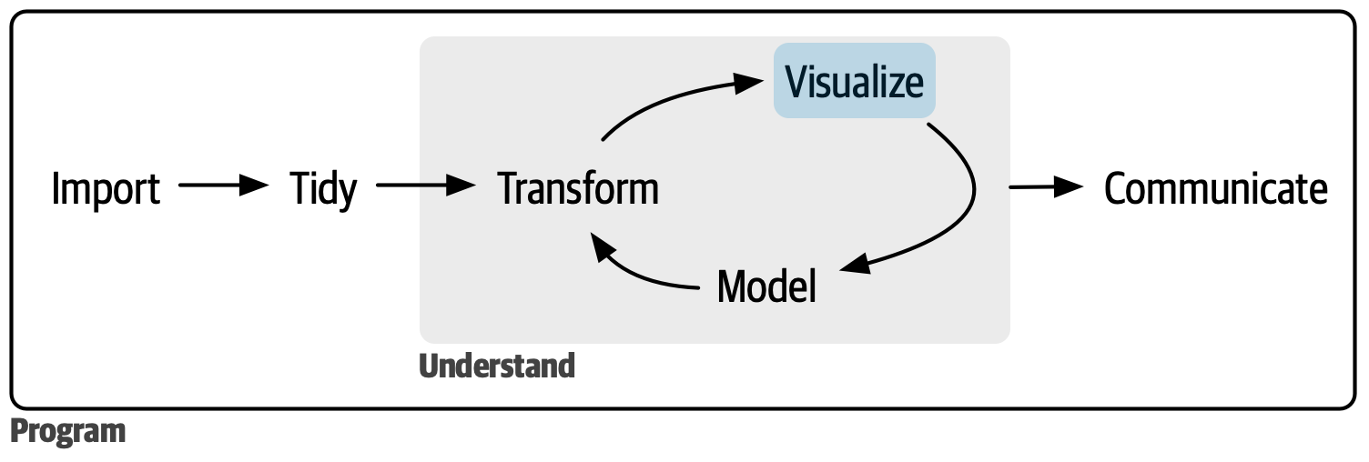
Visualize
After reading the first part of the book, you understand (at least superficially) the most important tools for doing data science. Now it’s time to start diving into the details. In this part of the book, you’ll learn about visualizing data in further depth.
Each chapter addresses one to a few aspects of creating a data visualization.
In 9 Layers you will learn about the layered grammar of graphics.
In 10 Exploratory data analysis, you’ll combine visualization with your curiosity and skepticism to ask and answer interesting questions about data.
Finally, in 11 Communication you will learn how to take your exploratory graphics, elevate them, and turn them into expository graphics, graphics that help the newcomer to your analysis understand what’s going on as quickly and easily as possible.
These three chapters get you started in the world of visualization, but there is much more to learn. The absolute best place to learn more is the ggplot2 book: ggplot2: Elegant graphics for data analysis. It goes into much more depth about the underlying theory, and has many more examples of how to combine the individual pieces to solve practical problems. Another great resource is the ggplot2 extensions gallery https://exts.ggplot2.tidyverse.org/gallery/. This site lists many of the packages that extend ggplot2 with new geoms and scales. It’s a great place to start if you’re trying to do something that seems hard with ggplot2.